📊 Heatmaps: Visualizing User Behavior Explained Simply
In today's digital landscape, understanding user behavior is vital for optimizing websites and improving user experiences. One of the most effective tools to visualize this behavior is through heatmaps. 📊 Heatmaps: Visualizing User Behavior Explained Simply aims to demystify this powerful tool, offering insights into how it works, its benefits, and how to effectively interpret its data. Whether you're a webmaster, a UX designer, or a digital marketer, grasping the concept of heatmaps can significantly enhance your approach to user engagement and site optimization. In this article, we will break down the essentials of heatmaps, explore their various types, and discuss how to leverage them for maximum impact.
Key Takeaways
- Heatmaps visually represent user interactions on a webpage, making it easier to analyze behavior.
- There are several types of heatmaps, including click, scroll, and mouse movement heatmaps, each serving different analytical purposes.
- Heatmaps work by aggregating user data and displaying it in a color-coded format for quick insights.
- Using heatmaps can significantly enhance user experience and optimize website design based on actual user behavior.
- Best practices for creating heatmaps involve ensuring clear objectives, accurate data collection, and proper interpretation of the results.
What is a Heatmap?
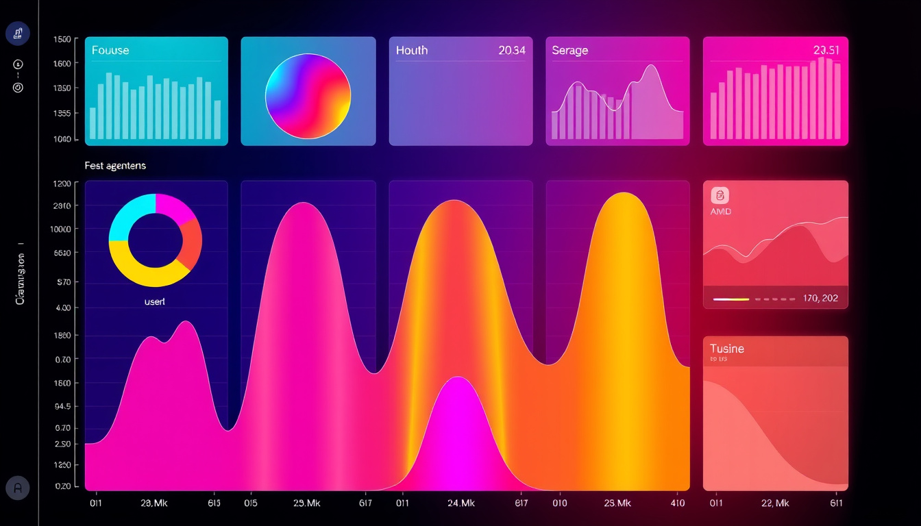
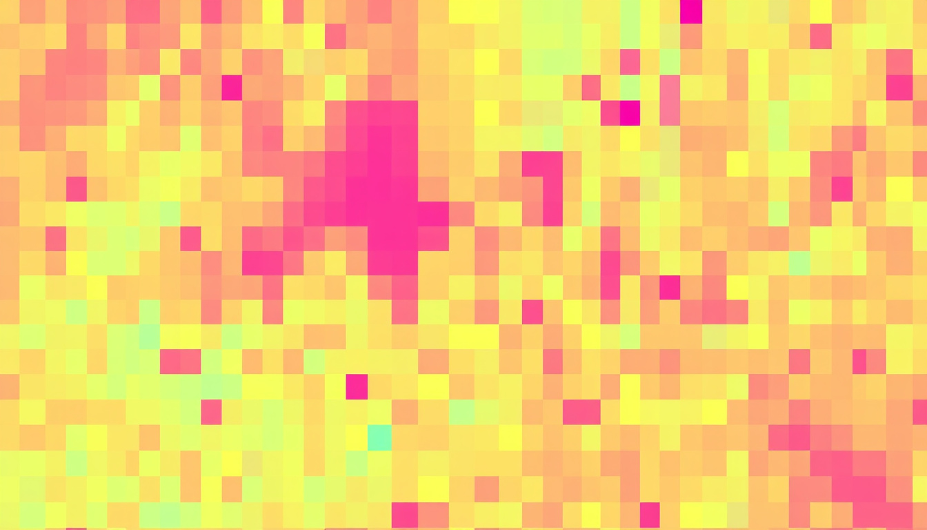
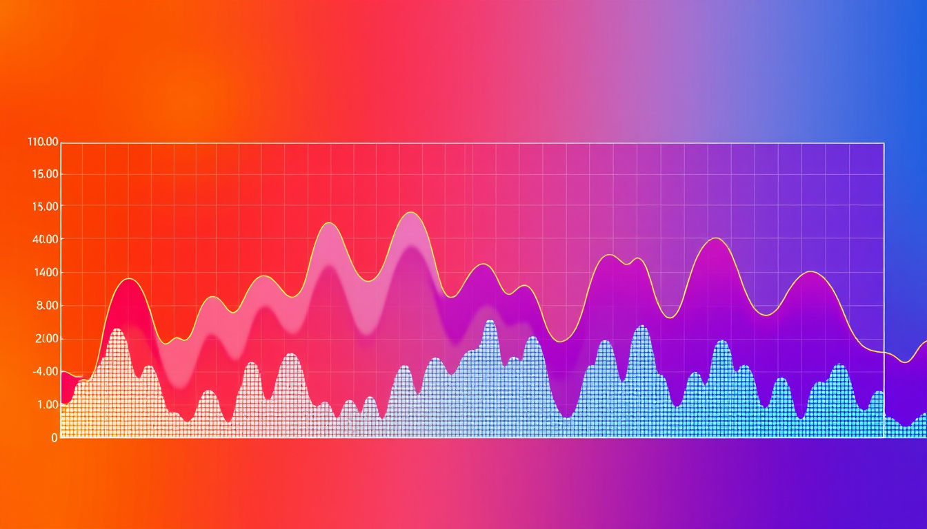
Heatmaps: Visualizing User Behavior Explained Simply A heatmap is a powerful data visualization tool that uses color to represent the intensity of user interactions on a website or app. This analytical instrument provides invaluable insights into how users navigate and engage with digital content. By transforming complex user behavior data into easy-to-understand visuals, heatmaps help businesses identify popular areas on their site, optimizing layout and design for enhanced user experience. Typically, warmer colors like red or yellow indicate higher levels of engagement, while cooler colors like blue suggest less activity. Whether you’re analyzing where users click, hover, or scroll, understanding how to interpret heatmaps can lead to strategic improvements in design and user interface, ultimately driving better conversion rates and customer satisfaction.
Types of Heatmaps
When it comes to understanding user behavior on your website, 📊 heatmaps: visualizing user behavior explained simply can be incredibly effective. There are several types of heatmaps that offer different insights into how visitors interact with your online content. First, we have click heatmaps, which track where users click the most. This helps identify popular elements on a page and can guide design and content decisions. Next, scroll heatmaps show how far down a page users scroll, revealing which areas grab attention and where users tend to lose interest. Another useful type is attention heatmaps, which analyze mouse movements to determine where users are focusing their attention. Finally, area heatmaps combine data from clicks and movements, providing a comprehensive view of engagement. By utilizing these various heatmap types, businesses can make informed decisions that enhance user experience and drive conversions.
'What gets measured gets managed.' – Peter Drucker
How Heatmaps Work
When it comes to understanding user behavior on websites, 📊 heatmaps: visualizing user behavior explained simply can be a game changer for digital marketers and UX designers alike. Heatmaps are powerful visualization tools that present data in a visually intuitive format, allowing you to see where users click, scroll, and hover on a webpage. By using color gradients—typically warmer colors like red and yellow to indicate high engagement and cooler colors like blue and green for lower interaction—heatmaps provide a quick snapshot of user activity. This method simplifies complex data, helping teams easily identify trends and areas for improvement. For instance, if a particular button is consistently receiving clicks, it signifies its effectiveness, while areas that users ignore may need redesigning or repositioning. By leveraging heatmaps, businesses can make informed design decisions, enhancing overall user experience and increasing conversion rates.
Benefits of Using Heatmaps
When it comes to understanding user behavior on your website, 📊 heatmaps: visualizing user behavior explained simply can revolutionize your approach to analytics. These powerful tools provide a visual representation of how visitors interact with your site, highlighting areas of high engagement and identifying elements that may be causing frustration. One of the key benefits of using heatmaps is their ability to simplify complex data, allowing you to quickly grasp user behavior patterns without getting lost in numbers and metrics. Additionally, heatmaps can significantly improve user experience by pinpointing what works and what doesn’t, enabling you to make informed design decisions. Furthermore, they aid in optimizing conversion rates by revealing which features attract clicks and engagement, thus directing your focus toward high-value content and calls to action. Whether you are looking to enhance your marketing strategy or streamline your website's design, leveraging the insights from heatmaps can lead to better user retention and ultimately a boost in your ROI.

Common Use Cases for Heatmaps
Heatmaps have emerged as an invaluable tool in the arsenal of digital marketers and UX designers for understanding user interactions on websites and apps. By employing 📊 heatmaps: visualizing user behavior explained simply, businesses can gain insights into how visitors engage with their content, revealing which areas attract the most attention and which elements go unnoticed. Common use cases for heatmaps include optimizing webpage layouts by identifying sections that receive the most clicks, understanding scroll behavior to ensure important information is placed within the ideal viewable area, and improving conversion rates by refining call-to-action buttons based on user interactions. Additionally, heatmaps can be useful in A/B testing scenarios, allowing teams to compare visual data from two different versions of a site to identify the most effective design. Ultimately, leveraging heatmaps leads to informed decision-making that enhances user experiences and drives business success.
Best Practices for Creating Heatmaps
Creating effective heatmaps is crucial for understanding user behavior on your website, and following best practices can elevate your insights. First, it's important to select the right type of heatmap—click maps, scroll maps, and move maps each provide different perspectives on user interaction. 📊 Heatmaps: Visualizing User Behavior Explained Simply can help you identify not only where users are clicking but also how far down the page they scroll and how their mouse movements correlate to engagement. Next, ensure that your data is collected over a reasonable timeframe to account for variations in user behavior; a few weeks of data is typically sufficient. Additionally, segmenting your audience can yield more targeted insights—for example, comparing new versus returning visitors can highlight differences in how various user groups interact with your content. Lastly, it’s beneficial to regularly analyze and review heatmap data in conjunction with other analytics tools, allowing for a comprehensive view of user behavior. By adhering to these best practices, you can harness the power of heatmaps to make informed decisions that enhance user experience and optimize your website.
Interpreting Heatmap Data
When it comes to understanding user behavior on a website, 📊 heatmaps: visualizing user behavior explained simply can be one of the most powerful tools in your analytics arsenal. Heatmaps provide a graphical representation of data where values are depicted by color. By using heatmaps, you can easily identify which areas of your website attract the most attention, revealing where users click, scroll, and hover. This visual format simplifies the interpretation of complex data sets, making it more accessible for marketers and web designers alike. For example, a bright red spot on a heatmap indicates a high concentration of user interaction, while cooler colors like blue or green suggest areas that may require attention or optimization. By analyzing this data, you can make informed decisions about layout changes, content placement, and even calls to action to improve user experience and drive engagement. Understanding how to leverage 📊 heatmaps: visualizing user behavior explained simply can significantly enhance your site's performance.
Frequently Asked Questions
What is a heatmap?
A heatmap is a data visualization technique that uses color to represent the intensity of data values across different areas in a graphical format, allowing users to quickly understand patterns in user behavior.
What are the different types of heatmaps?
There are several types of heatmaps, including click heatmaps, scroll heatmaps, attention heatmaps, and movement heatmaps, each representing different aspects of user interaction and engagement.
How do heatmaps work?
Heatmaps work by tracking user interactions on a website, such as clicks, scrolls, and mouse movements, and then aggregating this data to create a visual representation where color intensity indicates areas of higher interaction.
What are the benefits of using heatmaps?
Benefits of using heatmaps include gaining insights into user behavior, identifying areas for improvement on a website, enhancing user experience, optimizing content layout, and driving higher conversion rates.
What are some common use cases for heatmaps?
Common use cases for heatmaps include analyzing website performance, improving landing page designs, optimizing call-to-action placements, and enhancing overall user navigation and experience.
Authored by - Abdulla Basha
Email id - mail@abdullabasha.com
Linkedin