and Fonts to Stand Out Instantly
In today's fast-paced digital world, the importance of typography cannot be overstated. With countless brands vying for attention, it is essential to use effective typography and fonts to stand out instantly. Typography goes beyond just the text' appearance; it sets the tone for your brand's message, influences perception, and affects readability. Whether you’re designing a website, crafting an advertisement, or creating a logo, understanding how to utilize different fonts effectively will play a critical role in how your audience interacts with your content. In this article, we'll explore the various types of fonts, how to choose the right one for your brand, and tips for creating an eye-catching typographic design that truly resonates with your audience.
Key Takeaways
- Typography significantly impacts brand perception and recognition.
- Different font types serve unique purposes and convey distinct emotions.
- Choosing the right font aligns with your brand identity and message.
- Contrast and combination of fonts enhance visual interest and readability.
- Color plays a crucial role in reinforcing font choices and overall design.
Introduction to Typography and Its Importance
Typography is a crucial element of design that involves the art and technique of arranging type to make written language legible, readable, and visually appealing. Understanding typography is essential for anyone looking to create engaging content, whether it's for print or digital media. Good typography not only ensures that your message is clear but also enhances the overall aesthetics of your work. By thoughtfully choosing fonts to stand out instantly, designers can evoke emotions, establish brand identity, and create a strong visual hierarchy. The selection of typography and fonts is not just about personal preference; it influences the way your audience perceives your message and interacts with your content.
Understanding Font Types: Serif, Sans-Serif, and More
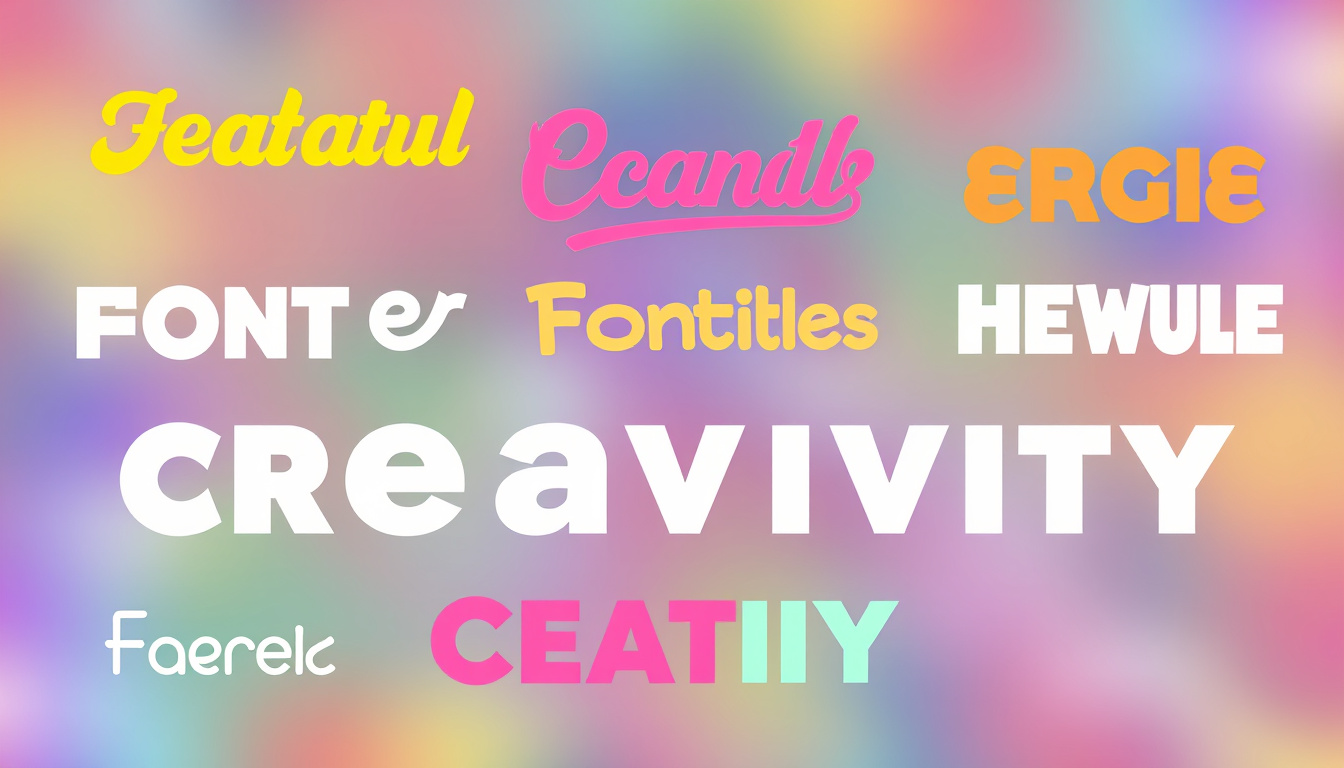
When it comes to typography, understanding font types is essential for effective communication and design. Fonts can be categorized primarily into two groups: serif and sans-serif. Serif fonts, like Times New Roman and Georgia, are characterized by their decorative strokes at the ends of letters, which can convey a sense of tradition and reliability. On the other hand, sans-serif fonts, such as Arial and Helvetica, feature a clean and modern appearance without these embellishments, making them a popular choice for digital content. In addition to these two main categories, there are also script and display fonts that can add personality and flair to your designs. Choosing the right font can significantly impact your branding, making it crucial to select fonts that stand out instantly and resonate with your target audience. By combining different font types wisely, you can create visually appealing and effective designs that enhance readability while communicating your brand message.
'Good typography is like good manners. It should be invisible, but when it's not there, you notice right away.' - James Felici
Choosing the Right Font for Your Brand
Choosing the right font for your brand is a critical decision that can significantly impact your overall branding strategy and how your audience perceives you. Fonts are not merely decorative elements; they convey your brand’s personality and values at a glance. When selecting fonts to stand out instantly, consider attributes like readability, tone, and uniqueness. For instance, serif fonts exude tradition and reliability, making them ideal for established brands, while sans-serif fonts offer a modern and clean look, perfect for innovative companies. Additionally, pairing fonts thoughtfully, such as combining a bold display font with a simple sans-serif for contrast, can enhance brand recognition. Always remember that your choice of font should align with your overall brand aesthetic and the message you wish to convey; this will ensure that your brand not only stands out visually but also resonates deeply with your target audience.
How to Create Contrast with Font Styles
Creating contrast with font styles is essential for any designer or content creator looking to enhance readability and visual appeal. By strategically pairing different typefaces, you can draw attention to key elements of your design and break the monotony of text-heavy layouts. To begin, consider the hierarchy of your content: use bold or italic fonts to emphasize headings, while complementing them with a sans-serif typeface for body text to maintain clarity and legibility. Another effective technique is to mix serif and sans-serif fonts; for example, pairing a sophisticated serif font for headlines with a clean sans-serif font for paragraphs can create a striking visual dynamic. Additionally, incorporating varying weights and sizes of the same font family can further enrich your design. Experimenting with contrasting colors for your fonts is also vital; bold colors against a neutral background can make your text pop, ensuring that your message stands out instantly. Ultimately, the goal is to create a visually appealing composition that captures your audience's attention while maintaining a professional look.
Tips for Combining Fonts Effectively
Combining fonts effectively is both an art and a science, and when done right, it can elevate your design to new heights, making it memorable and impactful. First and foremost, it's essential to choose a primary font that embodies your brand's personality, while contrasting it with a secondary font that complements without overpowering. For instance, pairing a bold display font with a clean sans-serif can create an eye-catching yet harmonious look. Additionally, consider the mood you want to convey: serif fonts typically evoke a sense of tradition and reliability, while sans-serif fonts project modernity and simplicity. Use font sizes strategically; a larger size for headlines can help capture attention and guide the viewer through your content effectively. Don't forget about line spacing and letter spacing, as proper adjustments can enhance readability and overall design cohesion. Remember, the key to combining fonts effectively lies in balance and contrast, allowing different and fonts to stand out instantly without overwhelming your audience.
The Role of Color in Typography
When it comes to design, the role of color in typography and fonts to stand out instantly cannot be overstated. Color enhances the visual appeal of text while also conveying emotions and branding messages. Employing the right colors in your typography can create a powerful first impression and make your content more engaging. For instance, using vibrant hues can attract attention and foster a sense of excitement, while softer shades might communicate calmness and professionalism. Furthermore, contrasting colors help improve readability, ensuring that the message is not only seen but also understood. By thoughtfully selecting color palettes that harmonize with your chosen fonts, you can create a cohesive brand identity that resonates with your audience, ultimately leading to higher engagement and conversion rates.
Conclusion: Making a Lasting Impression with Fonts
In conclusion, using the right fonts is essential for crafting a memorable brand identity and ensuring your designs leave a lasting impression. Carefully selected typography can significatively enhance readability, convey your brand's personality, and ultimately help your message resonate with your audience. Remember that simplicity often leads to elegance; thus, opting for clean and versatile fonts will allow your work to stand out instantly without sacrificing professionalism. Emphasizing the importance of both font choice and styling can dramatically influence how your content is perceived. By understanding the psychological impact of fonts, you can effectively tailor your marketing materials, websites, and social media content to engage and captivate users. So, as you move forward in your design endeavors, keep experimenting with fonts and fonts to stand out instantly, ensuring your visuals communicate effectively and compellingly.
Frequently Asked Questions
What is typography and why is it important for branding?
Typography is the art and technique of arranging type to make written language legible, readable, and visually appealing. It's important for branding because it helps create a strong identity and can evoke emotions, convey messages, and enhance user experience.
What are the main types of fonts and how do they differ?
The main types of fonts are Serif, Sans-Serif, Script, and Display. Serif fonts have small lines at the ends of their strokes, offering a classic look; Sans-Serif fonts are clean and modern without those lines; Script fonts mimic handwriting; and Display fonts are decorative, meant for headlines and attention-grabbing text.
How can I choose the right font for my brand?
To choose the right font for your brand, consider your brand's personality, target audience, and the emotions you want to evoke. Test different fonts to see how they align with your brand message and ensure they are legible across various mediums.
What tips can I follow to effectively combine different fonts?
When combining fonts, aim for contrast by pairing a bold font with a lighter one, or a Serif with a Sans-Serif. Limit your combinations to 2-3 different fonts to maintain coherence, and ensure they complement rather than clash with each other.
How does color influence typography in branding?
Color plays a crucial role in typography as it can enhance readability and convey brand emotions. Different colors evoke different feelings, so choose colors that align with your brand’s message while ensuring sufficient contrast with the text for clarity.
Authored by - Abdulla Basha
Email id - mail@abdullabasha.com
Linkedin